Design
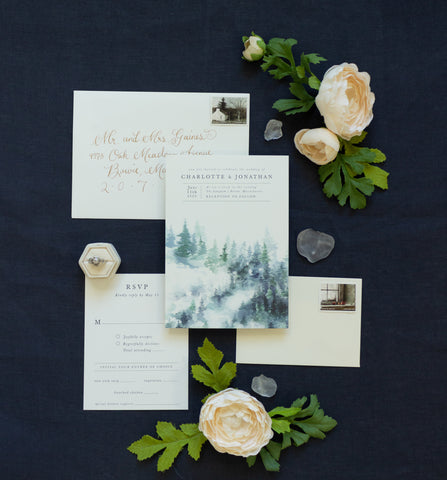
Morlock & Levett Wedding Stationery
by Anne Kostecki

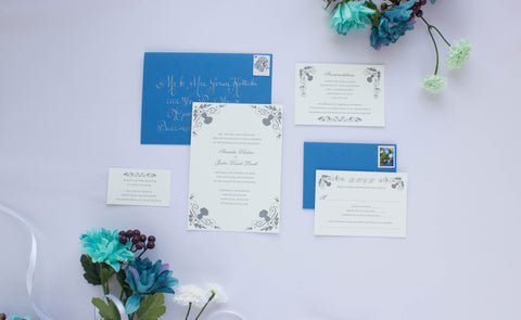
I was so excited to be contacted by a high school friend about her upcoming wedding. She described her event as an early spring wedding at the Provincial House of her alma mater, the University of Missouri St. Louis. She envisioned a traditional ceremony with close family and friends, a classic lace beaded gown, and design elements that pulled from her family history. She shared images that inspired her: dark romantic florals, her intricately filigreed engagement ring, and a palette of cool blues and soft grays. She liked traditionally styled invitations with serif and script typefaces and simple color palettes. We thought about featuring her chosen wedding flowers: blue dahlias and Scottish thistles, since those evoked the intricate shapes and moody colors she was drawn to. She chose the thistles to evoke her family's heritage.
For this invitation suite, I worked with the bride to develop a classic, elegant look for each piece. I researched the florals and drew several illustrations in different compositions, and she was most drawn to the stylized, symmetrical, Victorian-style thistles. I drew ornamental corners with thistles, flourishes, and the characteristic sharp, tapering leaves of the plant. Once we decided on the style of floral illustration, I adapted each illustration to fit each card: the reply card, accommodations card, and reception card. I paired a classic, balanced script typeface with a serif typeface, with a traditional centered justification.
The bride loved the classic simplicity, and couldn't wait to get the suite printed. We went over several options, and I was thrilled when she decided to go for a single color letterpress suite. I called Gilah Press + Design, a favorite printer of mine, and we decided on paper and ink. The stationery was letterpress printed on cream 118# Savoy stock with dark gray ink. I paired the suite with A7 and RSVP Adriatic blue envelopes and white ink calligraphy.