Blog
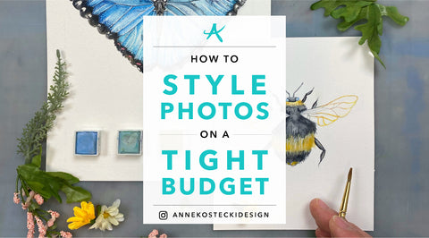
How To Style Photos On A Tight Budget
by Anne Kostecki

Have you ever scrolled through Instagram or Pinterest and seen amazing photos of print design, styled so perfectly that it stops you in your tracks? Have you ever wanted to style your work like this, but felt like it was completely out of reach for you? I have! Whether you feel limited by your photography skills, equipment, styling ability, props, or time, I know exactly how you feel.

When I first started my design career, I had no idea how to style photos. My undergraduate program didn't offer any education on this topic, and most professors and students just photographed their work on a white background.
This "less is more" aesthetic was so ingrained in me, that I photographed my work on nothing but a blank white background for years. And, I told myself, it was much cheaper to style your photos with nothing than with expensive props I might use only once.
After a while, I started to yearn for more variety and excitement in my portfolio. I dreaded all of my project photoshoots, because I had no idea what I was doing, and most of the time when I shot the photos, I would mess something up and have to shoot them again. The photos would be blurry, overexposed, crooked, or any number of things, and I didn't know how to use Adobe Lightroom enough to fix them.

It felt too brave to try to style my photos (not to mention expensive), and so I put it off. But then came a time when I realized that my work didn't look it's best on a plain white background. Some of my print projects look best like that, but things like wedding stationery or packaging design needed some styling to really shine.
And after many years of experimentation and failures, I finally feel confident enough to share what I've learned. And best of all, I can share all of my money-saving tips to make your work look like a million bucks, without the price tag!

What is photo styling?
So, what is photo styling exactly? Photo styling is creating a "mood" or "story" in a photograph: through lighting, positioning, props, organization, color, texture, and other tangible objects.
When I talk about photo styling, I mean the physical arrangement of your design with accompanying objects/props. It's a given that you should have some basic photography skills first before you begin styling (good lighting, shutter speed, etc.). The good news: these skills are very easy to learn! I will be writing a post about basic photography principles with your smartphone, and I will link it here.

Why photo styling?
So, why go through the effort? Why should you arrange your work with little baubles or flowers, with backdrops or even out in nature?
Because you know the difference between a well-styled photo and a poorly styled one.
A well-styled photo grabs your attention, either with rich detail, perfect symmetry, variety of textures, beautiful asymmetry, or any number of things.
Photo styling can make the simplest print designs look luxurious and expensive, even if they're not. And conversely, poor photo styling can make a great design look boring or thoughtless.
Photo styling can be fun, creative, and rewarding in its own right. There are lots of people who make a living styling photos: for magazines, chefs, artists, creators, corporations, etc.
So, let's get started!
1. Collect images of well-styled photos that inspire you.
I recommend starting a Pinterest board of styled photos. Here is a link to some of my favorite styled wedding invitation suites. Wedding stationery is always easy to find since it is one of the most commonly photographed, but there are lots of other types of design out there (print, packaging, branding, etc.).

Weddings
There are tons of wedding blogs, but here's a few with some curated shoots: Style Me Pretty, Grey Likes Weddings, 100 Layer Cake, Martha Stewart Weddings, and A Practical Wedding are some of the biggest names.

Packaging
The best place I've seen packaging design shoots is The Dieline.
Behance also has some great work on display.

Graphic Design
My favorite print design blog was FPO: For Print Only. Sadly, it is discontinued, but there is still work in the archives (including some of my work!).
Self-publishing platforms like Dribbble and Behance will have a mix of professional and student work, but it also features all types of design, so it may be hard to sift out specifically "photo styled" work.
I just discovered The Inspiration Grid, and I love it! Mindsparkle Mag, Visuelle, AIGA Eye On Design, Visual Journal, and Creative Boom are amazing sources of inspiration too.

Food Photography
Food Photography Blog is an excellent source for inspiration.
And if all else fails, Pinterest is always a good source of visual overload!
2. Study your inspirations, and distill what makes them great.
After you've gathered your inspirational styled photos, look at the images critically and ask some questions. Why were you drawn to these images? Besides the basic qualities of a good photo like good lighting, sharp details, and correct white balance, what attributes define the styling?

Are your inspirations more...
- Dark and moody? Bright and cheerful?
- Romantic, layered, lush? Spare, minimalist, organized?
- Perfectly straight and square, or tilted/organic, artfully messy?
- Shot from above, at an angle, with any depth of field?
- Full of a variety of props, or few/no props?
- Fabric backdrops, patterns, grass, wooden shelves, marble, etc.?
- Does the styling tell a "story" with the design, or not?
I recommend writing a list of adjectives that describes the styling that you like. Think about the types of designs you want to photograph: are you a packaging designer, a stationery designer, a blogger? Look at what others are doing in your field: what kinds of props are they using (or not using)? What types of items are you seeing?

For example, I first began styling images when I focused on wedding stationery. I saw lots of ribbon, vintage stamps, calligraphy pens, ink bottles, metal scissors, ring boxes, and flowers, always flowers. I began collecting these items, and storing them in a "styling bin," for future shoots. Once you have a working idea of what kinds of items you'll need, you can always be on the lookout for them. Which brings me to the next step...
3. Survey your home, and reach out to your network.
Now that you have an idea of what/how you will style, it's time to survey your home! Do you have any interesting keepsakes that will photograph well? A beloved childhood item, a vintage thing, a one-of-a-kind souvenir? Catalogue them, and remember to ask them to borrow those items!

Here's what I've learned over the years about found props:
- Smaller is better. If you're photographing a handheld design (like stationery, a book, etc.) anything bigger than the palm of your hand may look huge, and distract from your design.
- Make sure it can lay flat or stay put. Spherical items like holiday ornaments or globes can be a challenge.
- Living plants are messy. Living plants can shed dirt or pollen...and can stain your design or your backdrop.
- Remove branding/packaging from props. Unless it pertains to your project, I remove any stickers or packaging from items like ink bottles or spice bottles so that I'm not using another company's artwork in my shoot.
- Make sure it's clean. You wouldn't believe how many times I've taken photos, only to see dirt smudges, sticker residue, dust, etc. on a prop.
Once you've found some suitable candidates, I would find a way to store them near each other or together. I found that I am way more likely to use props if I keep them in a "prop box," or with my photography equipment. I don't want to have to search all over the house to find it every time I shoot photos.
4. Make a list of any additional items you may need.

Need is the key word here! Unless budget isn't an issue, I don't recommend buying a lot of props right off the bat. It's hard to know how often you may use something, so that's why I recommend making a list of items you might need first.
Go through all of your inspirational photos and your current props, and see if there is something missing. Think about what you would do with these props if you had them: do they have alternate uses? Or, would it be a complete waste of money if you bought them?
When I first gathering styling materials, I started buying discounted ribbon at Michael's whenever I had the chance (and when it was on sale). It was only $1-$3, small, and I could use it for a gift whenever I was done photographing it. I also started using the 40% off one item coupon and just buying one bouquet of fake flowers. I collected the flowers into a large bin and now use them for all of my wedding stationery shoots. And when they're not in use, I decorate my house with them, so they're (kind of) useful in some small way!
5. Scour the thrift stores, antique stores, online retailers, and yard sales.
 I'm not much of a thrift or antique shopper myself. But I've had some luck finding food photography props at Goodwill. Do a search to see what kinds of secondhand or discounted stores are in your area.
Here's a list of ideas:
Faux backdrops, acrylic blocks, and discount linens!
The backdrop to your photo styling can be almost anything: fabric, wood, marble, dirt, metal, anything! You might be thinking, how in the world can I have all of those materials on hand? I don't have the room, or the money for all of that!

Well you're in luck, because you can fake it! There are contact papers with all of those textures: wood, marble, metal, and anything else you can think of! These contact papers are usually meant for walls and other surfaces, but I just roll them out on some lightweight foam core board. There, you have an automatic backdrop!
I've seen these new things around the internet, and they're basically portable backdrops for photographers. They are cleverly designed: they're either a hoop-like structure with two fabric sides (and it can be folded on itself for portability) or they are flat, hard surfaces that can be snapped into a L-shaped "back" and "ground," and then separated and stored flat.
I attended a photo styling session at a design convention, and one of the most useful tidbits I learned was to use acrylic clear stamping tools to create a "raised" dimensional composition with my wedding invitation designs.

Simply place the acrylic blocks underneath different pieces to create depth in your flat lay. They even work well in flattening thick or bent paper that refuses to lie flat!
These are the acrylic blocks I use. I recommend getting some in different shapes/sizes, and stack them in different ways.
Essentials for wedding stationers (and flat lays in general)
If you are interested in styling photos for your wedding or party invitation designs, then there are some essential elements you should know about!

- Stamps. I collect stamps from the USPS, and most of my stationery colleagues collect vintage stamps from Amazon or various websites. I use very nimble scissors and cut the stamps out while they're still attached to the backing paper, making sure to cut just below the scalloped edges. Then, you can reuse the stamps in your flat lays over and over, and there's just the right amount of adhesive-ness on the edges to keep them down.

- Ring boxes. It took me a long time to get some ring boxes, because I didn't really think it was worth investing in them. Velvet ring boxes are very expensive, and I didn't want to buy some and never use them. Well, I hate to say it, but I do have a set of them I purchased from Etsy and have yet to use them. They are very beautiful though, and I have some projects in the works where I will use them.

- Calligraphy paraphernalia. Even if you don't practice calligraphy, it's good to have a calligraphy pointed pen and an ink bottle for styling. I would get the old-fashioned metal nibbed ink pens, not any markers or brush pens or anything like that (items without any branding on them, per my previous recommendation). They're not too expensive, and you can always give calligraphy a shot to see if you like it! I would get a pen and ink from Michael's with a coupon and save some money. A wax seal stamper is also useful, but not cheap.

- Ribbon. As I previously said, I bought a lot of ribbon from Michael's when it was on sale, and kept it for future shoots. There are all kinds of places to buy ribbon, and you can use it to tie your wedding invitation suites together, as a decorative element, or you can use it for general packaging and gift giving if you're not using it for styling.

- Flowers. I almost always use fake flowers. And the reasoning is: not only do fake flowers not spray pollen, dirt, or petals on your flat lay, but they are MUCH more affordable, and they last forever! You can get these from Michael's too, but I actually bought a lot of my fake flowers from a local flower wholesaler. This place was so off-the-books, that they don't even have a website! But their prices were the best I've ever seen. So if you find a wholesaler near you, call them and see if you can shop their warehouse. You will be amazed!

- "Fillers." These can be of your choice, but some of my personal favorites are: crystals, stones, marbles, seashells, small trays, confetti, tulle, and votive candles. Anything that is a "vase filler" at Crate & Barrel or Target would probably work.
6. Practice a whole lot.

I admit, I hated photographing my work for years. It was always such a drag, I would put it off until I absolutely had to update my portfolio. I never felt like the lighting was quite right, and pulling together all of my styling materials, just to have everything look like a mess, just seemed to be a waste of time to me. I was convinced it would look bad before I even started, and that energy carried over into my flat lays.
Go back to your list of inspirations and why you like them. Close your eyes and imagine how your work would look its best: think about the color or texture of the background, how many elements will be in the shot, different compositions, and what props would help that story. I recommend thinking about different compositions in your head, and then playing around with the elements to see what looks good.
There are two opposing "styles," I would try out for a few projects: perfectly straight flat lays (where the paper cards are all parallel) and organic ones (where the elements fan out, or are otherwise not straight). Different compositions may work for different projects.
It's good to keep an open mind, which is something I didn't do for a long time...I made all of my compositions more or less the same. It definitely got boring! The more I took my time and tried to have fun with photo styling, the better I got. I felt more confident taking risks, and that's when I started getting more compliments on my work.
7. You can (almost) always fix mistakes in post-production.

If you are presenting your work professionally, I recommend utilizing photo editing software. The standards are Adobe Photoshop and Lightroom, and I recommend them both for different purposes.
Photoshop is excellent for all kinds of edits, and it's great if there are very specific types of things you want to edit (wrinkles in fabric, errant items in a flat lay, etc.). Photoshop is perfect for "faking" certain conditions (like lighting) and adding/subtracting individual things in a photo. Even though it's a great program, I do the bulk of my photo editing with Lightroom, and here's why.
When you take a lot of photos, like you would in a flat lay, Lightroom allows you to sync all of your edits to a group of photos. It saves SO much time to sync edits, like lighting, saturation, highlights, toning, lens correction, etc. And Lightroom has very sophisticated photo corrections, like straightening crooked lines, changing the exposure, and enabling profile corrections for specific brands of lenses.
I took a Lightroom training course a few years ago, and was blown away by its sophistication. I recommend spending time with Lightroom and playing with its features, because you will be amazed!
So, in conclusion, if you upload your styled photos and see a few things you'd like to change a bit without setting up all of your supplies again, then get familiar with photo editing software.
Get creative!

I hope that these tips help you in your photo styling journey. I know that for me, saving money is of the utmost importance while I style my photos, not just for the financial incentive, but also because I don't want to clutter my house with stuff. You can work wonders with a few good items and some ingenuity.
If you have any suggestions for me, or links to shops that sell affordable supplies, please contact me! And again, thanks for reading. Share with others who can benefit from these tips, if you please.


0 comments