
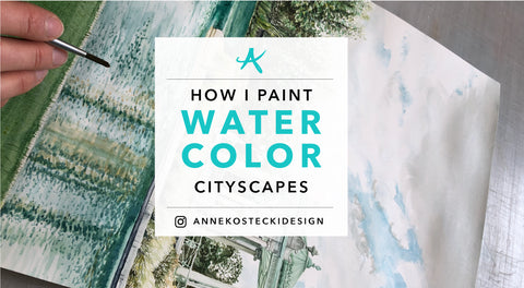
Blog
How I Paint Watercolor Cityscapes
by Anne Kostecki

One of the first things people tell me when they see my art is "It's so detailed!" or something relating to its realism, and referencing the difficulty to do with watercolor paint. It's a wonderful compliment to be sure, but to be honest, it's how I've painted my whole life. I guess it's part of my psyche (I'm a Capricorn, ENTJ, Enneagram 8 and 1, generally a rationalist/perfectionist/analyst).
I paint a lot of subjects, but I get nitty gritty with cityscapes and architecture. I love travel, and I love capturing the essence of a place, or at least the way I see it. I have been painting watercolor since I was about 14 years old. I've had lot of time to experiment, and to me, experimenting is the most important thing you can do when practicing art. And I mean real experimenting: not following tutorials or visual aids, just doing something completely out of the box to see what kind of mark you leave on the page.
So in my many experiments, I have painted all kinds of colors on all kinds of papers. I've mixed colors together without any sort of mathematical equation, and just painted. I've grabbed paper out of my watercolor paper stack, without knowing anything about it, and just painted. So, I don't have an encyclopedic knowledge of all watercolor products and brands, and I definitely don't follow all of the "rules" all of the time. I hope this is helpful in explaining how I think about painting watercolor.
I'm going to break it down into steps, and I will be including some techniques I teach in my Drawing Fundamentals course.
Step One
Choose the right reference photo; or, if you can, situate yourself and paint from life. I understand that it's not always easy or feasible to draw from life, but I will be honest: it is the ideal situation. Drawing from life will not only give you the perfect resolution, every time (images online tend to be poor resolution), but the three-dimensionality is actually helpful, not a hindrance. Your artwork will look and feel more realistic if you're more aware of all three dimensions.
If you're going with a reference photo, make sure you look at it very carefully and can answer this question: "Am I comfortable drawing all of the parameters, or should I selectively edit?" Some images have distracting electrical lines, bushes, deep shadows, or inscrutable details. Choose your composition carefully: make sure it is dynamic and interesting, and that you leave out unimportant details. Once you have a good idea in your head what it will look like, then begin sketching.

Step Two
Sketch carefully and lightly, using a ruler if needed. This step is crucial! Your sketch is the backbone of your artwork. Spend as long as you need sketching all of the details.
Start big: sketch the largest parts of your subject, and work your way down. I eyeball my paper and block out a few shapes to begin with, and when I eyeball each part, I roughly estimate what percentage of the image it should take up. I'll say to myself, "that looks like it takes about 2/3 of the image, so I'll draw it taking up 2/3 of the paper," and so on.
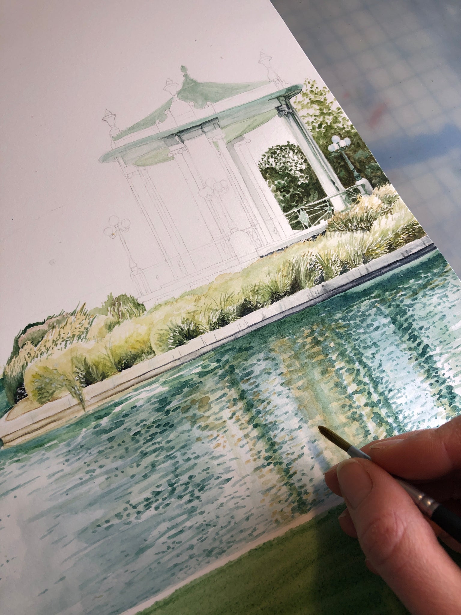
Once the big parts are drawn, then get down to the details. I look at my subject very carefully and fill in all of the railings, windows, gutters, doorways, and even block out the shadows. This will take some training. If you're new to drawing, then it will take some time before your eye begins to notice everything in an image. That's okay! Keep going, and do as much as you can.
Step Three
Paint the sky first, or largest portion of a single-color surface area. What I mean is: start with the largest part of your image, whether it be the sky, grass, sea, etc., and paint that first. In general, I always recommend painting watercolor lightest-to-darkest in terms of color. Watercolor really shines in the layers of glazing, and it's much easier to make something darker than it is to make something lighter if you make a mistake.
I will be honest: this step usually stresses me out! Painting a smooth, uniform sky or field is difficult for me, since my hand wants to add brushstrokes here and there. If you really want a smooth color, I recommend wetting your paper first, and doing a wet-on-wet technique.

Step Four
When all of the large areas have been painted or at least started with the first wash, then work lightest-to-darkest on all remaining areas. This will look different depending on your type of subject, and in fact, it might be easier for you to work left-to-right (if you're right-handed) or vice versa (if you're left-handed), but in general, remember to go LIGHT to DARK! Pale yellow, cream, ivory, and so on will go down first, and any pure vibrant colors (like ultramarine blue) can go down next. If you look closely at your subject, you will see immediately where the darkest areas are, and can mentally block them out in your painting.

Step Five
Add in those finishing details! Once you've painted all of the larger blocks of color, and all of the light areas are complete, then you can add those details. Railings, windows, awnings, ornaments, and all of those fine lines go down last. I rarely use rigger brushes (the thin, long-bristled brushes) because I don't love the lack of control I feel when using them. I often use a very tiny round brush (a 0 or even 000 sized watercolor brush) and paint as carefully as possible. This is a great point to take your time and do it right. In fact, if you have very small, dark lines you need to do, it may be best to use a Micron or other waterproof pen (I use size 0.005) and draw in those details. And don't worry if you make a mistake! If you need to add back some white, then I use white gouache paint or a white gel pen. I know it's not fun to spend hours and hours on a painting just to make a mistake! There's always a fix, as long as your entire paper doesn't get ruined.

So that's it! That's my process for watercolor cityscapes. Please let me know if you have any questions. See you later!


8 comments
Thank you so much, Anne Kostecki. I think you are a wonderfully talented artist. Your painting of the pergola and water is absolutely beautiful – I love the colour of the water. I have been painting watercolours about 10 years, and love colours. Unfortunately, I am not good at drawing. At 70 yrs. I don’t aspire to be a wonderful artist like yourself, but, because I really enjoy mixing colours I am happy plodding along. Most artists who post their articles tell us to paint dark to light. I agree with you painting light to dark. That’s why I feel your work is beautiful – you have honed your skills. Keep producing spectacular works of art.!
WOW
Thank you for the Wonderful Tips!
….and your writing is so well done, not only concise and relevant but also efficient in theme and function ….(did I say that right? i don’t know i’m just excited to begin! Lol) Basically I really enjoyed this article and wanted to express that!
I am ‘teaching’ myself. (i play with color mainly, 😆 lol)
What speaks loudest to me are your tips: Light to dark. …and selective editing(!) Heck yeah! I spend a lot of time erasing and redoing scenes and now I know how to improve that a bit, I can’t wait to incorporate your tips and see how my painting develops.
I will be looking into more of your articles as well.
Thanks again and stay well!
Yours truly,
Julie
I would love to see a youtube tutorial on how you paint cityscapes.