Design
Singer Ellis Wedding Stationery
by Anne Kostecki

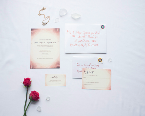
Janna approached me after she got engaged to her fiance Stephen and asked me to design her wedding invitations. She had a very modern, unorthodox vision for her wedding: a civil ceremony at the Magic House: a nonprofit children's museum of arts and sciences outfitted in a historic mansion. Her colors were burgundy and shades of deep red, with gold and pale sage greens. Her decor included clusters of succulents in geometric displays, with gold table runners, wood and eucalyptus branch accents. She and her fiance asked for an invitation that featured these colors, and wanted to bring together watercolor and geometric illustrations.
The first few watercolor compositions were interesting (the burgundy color palette made the painting look far too "blood" like!) so I added more gold tones and carefully layered geometric shapes to make a diamond-like effect. The bride recommended a script typeface she liked to pair with the Bodoni for the body copy. The couple used the extra RSVP and accommodations cards as decorative backdrops for the table numbers. The couple also repurposed the design into custom wedding signage (in lieu of a paper program) and matching dinner and bar menu signs.
The event also featured chalkboard signs, paper star lanterns, and other coordinating details. The invitation, RSVP card, accommodation card, and reception card were all printed on Mohawk Superfine Eggshell White 100# coverweight paper on a digital press. She mailed the invitations in A7 Stardream Quartz envelopes with custom copper calligraphy to match the script typeface of the invitation. They loved the invitations, and said they were shocked I was able to design something that featured such wildly dissimilar elements, because they weren't sure it was possible to combine soft watercolors with angular geometric design in the varied wedding color palette. It matched perfectly with their fun-filled autumn wedding!