Design
Herbst Spungen Wedding Stationery
by Anne Kostecki

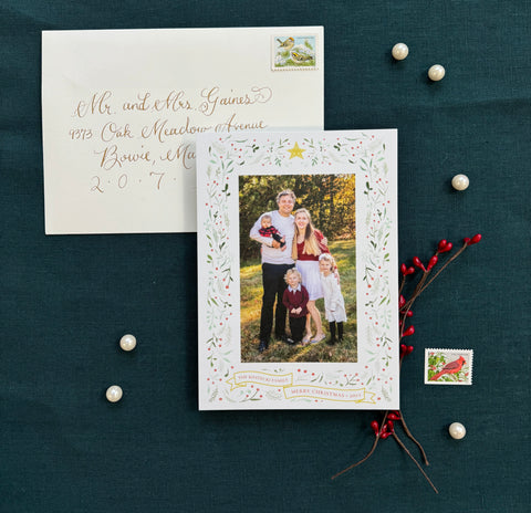
The introduction to the wedding stationery is the save the date card, and this postcard was designed to emphasize the couple's formal celebration in Pittsburgh. John and Leah choose their favorite photographs from their photoshoot, and asked to incoporate formal lettering and a icon of their names. I designed a monogram of their initials "J" and "L" which when combined, form an "H" for their new shared last name. The couple loved the monogram and used it throughout their wedding stationery and decor. The monogram featured an ornate lettering style which also inspired the look of their ketubah (wedding contract), invitation, and hand-carved wedding guestbook. The postcard was printed digitally on Mohawk Superfine Smooth White 80# cover paper. The postcards were mailed first class floral stamps and with printed addressing.


My brother and his fiance asked me to design their wedding stationery, and I was beyond excited to begin! They asked first for a custom wordmark or monogram, and I used their initials ("J" for John, "L" for Leah, and combined both letters into an "H" for their new shared last name, "Herbst") and they absolutely loved the result. They loved the monogram so much, we used it on their ketubah (a Jewish wedding contract), programs, wedding signage, foil cocktail napkins, thank you notes, and I hand-carved it into their wedding guestbook, which I also made by hand.
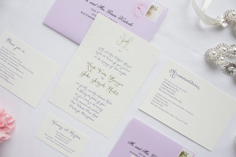
In addition to the monogram, the next design was the ketubah, which was inspired by early Renaissance Italian design, and featured laurel leaves and ornaments and painted in indigo, green, lavender, and metallic gold ink. Then we chose wedding colors: lavender, gold, ivory, and a deep purple for certain accents. Their wedding was to be an early summer, elegant affair in a historic Pittsburgh hotel, and the bride wanted to incorporate hand-drawn calligraphy with ornaments from my ketubah design. I designed the calligraphy for the invitation and headline copy for the accompanying pieces, and chose the typeface Centaur for the remaining copy. I also added handmade icons for the dinner selection on the RSVP card.
I proposed a letterpress suite, with gold foil accents, and a blind emboss of the Italian-style ornaments along the border of the invitation. We paired it with lavender envelopes, bound together with a lavender belly band and sealed with a gold wax seal (with their monogram embossed in it). The invitation suite was printed on 118# Savoy Natural paper, with a specially selected Pantone ink, gold metallic foil, and a blind emboss.