
Blog
A Step-By-Step Watercolor Landscape Tutorial
by Anne Kostecki


Hello! So I'll be honest with you: I painted and filmed the footage for this tutorial months ago...perhaps more than 6 months ago. I was asked to publish a step-by-step watercolor landscape tutorial, and I decided to photograph my process, but then procrastinated on actually writing the blog post. It's very easy for me to sit down and paint...but it's not easy for me to write, edit photos, or even think about my process in a way that is digestible for new artists.
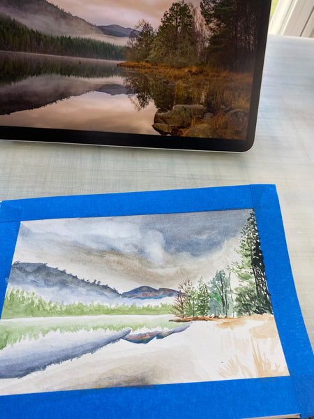
Anyway! Here is the thoroughly photographed tutorial. It's from a license-free reference image I was given by a photographer in the Free Reference Photos for Artists Facebook group I am a part of. It's by Leanne Findlay and it's a photo of the Scottish Highlands (a personal favorite place of mine).

Step 1: Gather and prepare all supplies.
For this painting, I painted in my Viviva sketchbook (affiliate link) and I used blue painter's tape to mark off the borders.

Here is a list of the supplies I used:
- Watercolor paint colors: Payne's Gray, Burnt Sienna, Sap Green, Yellow Ochre, Cadmium Yellow Light, Ultramarine Blue, Viridian Green, Burnt Umber, a touch of White Gouache
- Paintbrushes: Round brushes size 000, 2, 4 (I used this brand)
- Paper towels, water cup, and blue painter's tape
Step 2: Carefully observe your landscape.
There's no shortcut for this one. You'll have to take a minute and observe your landscape. Maybe more than a minute. Close your eyes, and imagine what it would look like on your paper. Then, look at your paper.

When I start a landscape, I usually start with the horizon line, and sketch that lightly. I generally draw the land first, starting with the biggest shapes or areas. In this particular piece, I started sketching the big trees on the shore on the right side of the image.
I observe the photo and see that the tree/shoreline area takes up about 1/3 of the width, draw a little line guessing where the shoreline ends, and sketch within that area. There are 3 "major" or large/obvious trees on the right, so I sketch those first. Then I work around the smaller trees.
Next, I draw the mountains in the very back (there are 2, and they're very basic). Next is the treeline right in front of the mountains. Then I may go and sketch out details such as the rocks in front.
Important note: I rarely draw any details in the sky. This is because it's not as important for me to get the cloud shapes exactly correct, and because I believe watercolor skies often look best without pencil lines visible at all. If you are uncomfortable with this idea, then definitely sketch your sky: but I recommend keeping it light!
For this particular piece, I did not do sketching at all, as a personal challenge for myself. But I highly recommend sketching if this is new to you, or it makes you more comfortable!
Step 3: Paint from "back" to "front."
What I mean by this is: start with the objects that sit in the "back" of your image if you imagine it as a multi-layered diorama right in front of you. Your brain will instantly recognize the mountains as the furthest object away, then the treeline directly in front of the mountains, then the lake, etc. I decided to start with the sky on this one, so that I can visually "map" out where things will go underneath.

Since this sky is dark at the top edge, it's easy to map out where things should go: the dark swirls form almost a "cone" that points down to the landscape, and you can fit the mountains and trees underneath. I also find this a good time to paint the reflection the lake. This can be challenging to get exactly right, but don't beat yourself up trying to make it an exact reflection.
The primary colors I used for the sky were Payne's Gray and Yellow Ochre.

Well, it looks like I broke my own rules, sorry about that! I painted the treeline next, and I see why: there is a layer of mist that is separating the trees from the mountains, and since I already painted the lake, I wanted to paint a "midpoint" between the mountains and lake so that I had a general idea of how big each one should be. I used Sap Green for the trees.

Next up, I paint the reflection of the treeline in the water. I painted the trees to be more sharp/detailed about the lake, then used extra water on my brush to "blur" the trees' reflection and make it more watery in appearance.

Important thing to remember: objects in the back will inherently be lighter/bluer in color; and they will be less detailed. This is a natural phenomena to denote visualizing distance, and it's true in real life too. It will greatly add depth to your work to keep this in mind when you're painting the "back" of your image first. I used Payne's Gray with some touches of Ultramarine Blue for the mountains.

Step 4: Paint the shoreline on the right, with darker and sharper detail.

After you've painted the sky, mountains, and treeline (and their corresponding reflections), I would move on next to the shoreline on the right of the image. I mixed a burnt sienna with some yellow ochre to make the dirt color.

As you can see here, I am skittish about filling large areas of color. One of my habits as a painter is that I paint just "within" the area I think I need to fill, just in case I need to come back later and add on to it. This is a cautious way of painting to prevent you from accidentally filling in too large of an area that may encroach on other objects in the painting, like a tree or something else. Yes, I've learned this the hard way!
Step 5: Paint the trees, from "trunk" then to "limb."

Time for the trees to come in! Ok, When I say paint from "trunk" to "limb," what I mean is aim your brushstrokes from the center mass of the tree (where the trunk is/would be), to the outer branches. Flick your wrist so that the brushstrokes are horizontal, originating at the center of the tree, then the strokes get smaller the further away from the center of the tree you go.
For this particular painting, I "dabbed" a dampish brush loaded with paint (Sap Green and Viridian) to make broken, uneven, organic branch shapes, as you can see above.

Once I do initial layers of the lighter, abstracted branches, then I look at my reference photo carefully to see where there are trees with darker, more distinct branches. Once my paper is dry, that's when I use my small 000 brush and add the darker trunks and branches (with burnt umber, burnt sienna, sap green and some ultramarine blue).
My high school art teacher taught me this technique: don't draw every single branch. Be very, very light-handed with your brush, and barely drag it to make the lightest strokes possible. And, intersperse where the branches are visible between trees. What do I mean by this? Imagine the branch was broken into pieces, and that it was scattered on the floor. The branches wouldn't all connect at every juncture. If you paint the branches in a light, "broken" manner like that, then the appearance will make it look like the branches are intertwined, or layered in a real forest setting. Give it a try!
If you look closely at the image above, you can see the "interspersed" branch style I'm talking about. When doing trees like this, I dab a light green in the background, then I come in with the darker colors and add some branch details.

Here's a closeup of the small brush I use. I also make a conscious effort to differentiate colors between the trees so that it is not an incomprehensible blob of the same shade of green. You can see here that Sap Green is mixed with Viridian, Ultramarine Blue, Burnt Sienna and Yellow Ochre.

As you can see here, the darkest trees are the ones right in front. It gives the image depth.

Step 6: Paint the rocks, grasses, and shore.
Once I have the trees finished, I fill in the grasses and rocks in the immediate foreground. For grasses, I paint from bottom to top: this creates a natural shape that mimics the thicker part of the grasses attached to the ground, and it gradually tapers upward.

For rocks, I look at my image and see where the darkest shadows are. I create horizontal "hatch" marks that mimics the craggy, uneven surface of a rock. If you look at your photo, you'll see there are light spots, medium dark, and very dark spots; and without getting too exact, you can match these 3 value ranges.

Next I started painting the reflections of the trees and rocks in the water. These should be blurrier than the actual trees, but nice and dark to denote how close they are to the viewer.
Step 7: Finishing touches.

Usually I go back in and finish up the sky and lake, or any big areas that weren't quite finished during the first pass. In this case, I painted more cloud shapes in the sky.

Then I take my small brushes and do any finishing touches. I added darker grasses and shadows on the shore, and finished the color gradient on the mountain in the middle of the page. When I don't see any more details to add or I feel like I'm finished, then I sit back and peel the tape!

And you're done! I hope this step-by-step tutorial was helpful for you. This was the exact process I used for this piece, and I believe it took me probably 4 hours from start to finish. Although, I will be honest, I'm not very good at keeping track of my time! Thanks again for visiting, and visit my YouTube channel for more in-depth tutorials.
-Anne


0 comments